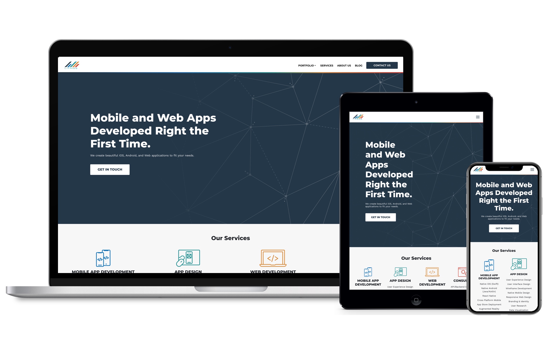
Responsive web design is an overall strategy for building websites that comprises web specification standards and flexible design standards. The philosophy behind it stems from the desire to create the web accessible to as many devices as possible.
Responsive design assures that a website displays correctly on desktops and mobile devices like smartphones and tablets. This relatively easy idea has spawned an entire generation of structures and tools like Bootstrap that automates much of the grunt work included in designing responsive sites.
THE THREE FEATURES OF RESPONSIVE WEB DESIGN
Responsive web design is defined by three defining features. These are media queries, fluid grids, and flexible visuals.
MEDIA QUERIES
Media queries are used to generate CSS rules (Cascading Style Sheets), a presentation language used to style the presentation of webpages.
In responsive web design, they can be used to manage a variety of webpage parameters including max-width, max-height, and aspect ratio. Media queries also allow developers to use condition analyses in order to change a web design based on the characteristics of a user’s device.
FLUID GRIDS
You can use CSS to design fluid grids, which are used in responsive web design to format columns of the text so that they automatically re-size in balance to the size of the browser being used.
By using percentages, as opposed to pixels (which can range in size depending on the device), CSS fluid grids allow webpages to change into a size that’s related to that of the browser display space. This enables you to build a site where the same image always takes up the relevant proportion of page space, which allows designers to create a consistent visual presence across numerous devices.
FLEXIBLE VISUALS
Flexible visuals enable you to adapt images and other media to load uniquely depending on the size of the device being utilized.
For example, if you were optimizing a desktop site for mobile devices, you could use CSS to fix the maximum width of a picture to 100% of the screen size, so that when that 100% becomes narrower, the picture does too.
When these three principles are mixed, they allow designers to create responsive websites that are flawlessly prepared for endless device innovations.
Why is responsive design so important?
If we designed and developed countless versions of a website that worked for all known devices out there, the process just wouldn’t be efficient time-wise and would be extremely costly! It would also render sites ineffective to future technology improvements and make them nearly difficult to maintain. Responsive design is an efficient solution to future-proof your website.
A major key to responsive web design is understanding your audience and what device they’re utilizing to view your website. How much of your current traffic is desktop vs. tablet vs. mobile? Nearly 56 percent of traffic in US websites is now from mobile devices. Today there are about 2.6 billion smartphone users and by 2020 that’s tipped to move over 6 billion. Mobile design has never been more vital.
It’s important to design your website for differing devices, but it becomes more complicated when designing across varying web browsers. Every major web browser has it’s own mobile version and provides sites differently. Where it gets even more complicated is that there are many versions of browsers that need to be provided for—you can’t expect everybody to be on the latest version. So it’s crucial that the design works and responds to a variety of browser versions.
Don’t worry, it’s a universal design challenge for everyone in the web industry. The best thing you can do is to keep updated with the current UI/UX best practices, design around your content, keep your images flexible, always examine your navigation and remember user experience is essential.


