Every year, we see new elements and styles in website design begin to emerge.
Some elements when incorporated thoughtfully improve how content looks on a specific device. Many of the elements have the potential to improve visitor’s experience with your website.
But with so many options to choose from, it can be challenging to determine which ones are really worth considering. To help you narrow your focus, we’ve detailed some important elements of modern website design that are common in many technical websites and can help you to improve your site’s performance.
Image Accordion

An accordion menu is a vertically stacked list of headers that can be clicked to reveal or hide content associated with them. It is one of many ways you can expose content to users in a progressive manner. Allowing people to have control over the content by expanding it or deferring it for later lets them decide what to read and what to ignore. Accordions shorten pages and reduce scrolling, but they increase the interaction cost by requiring people to decide on topic headings.
Some technical websites which have this element in common are SPEC INDIA, H20, appen.
Unique and Large Typography
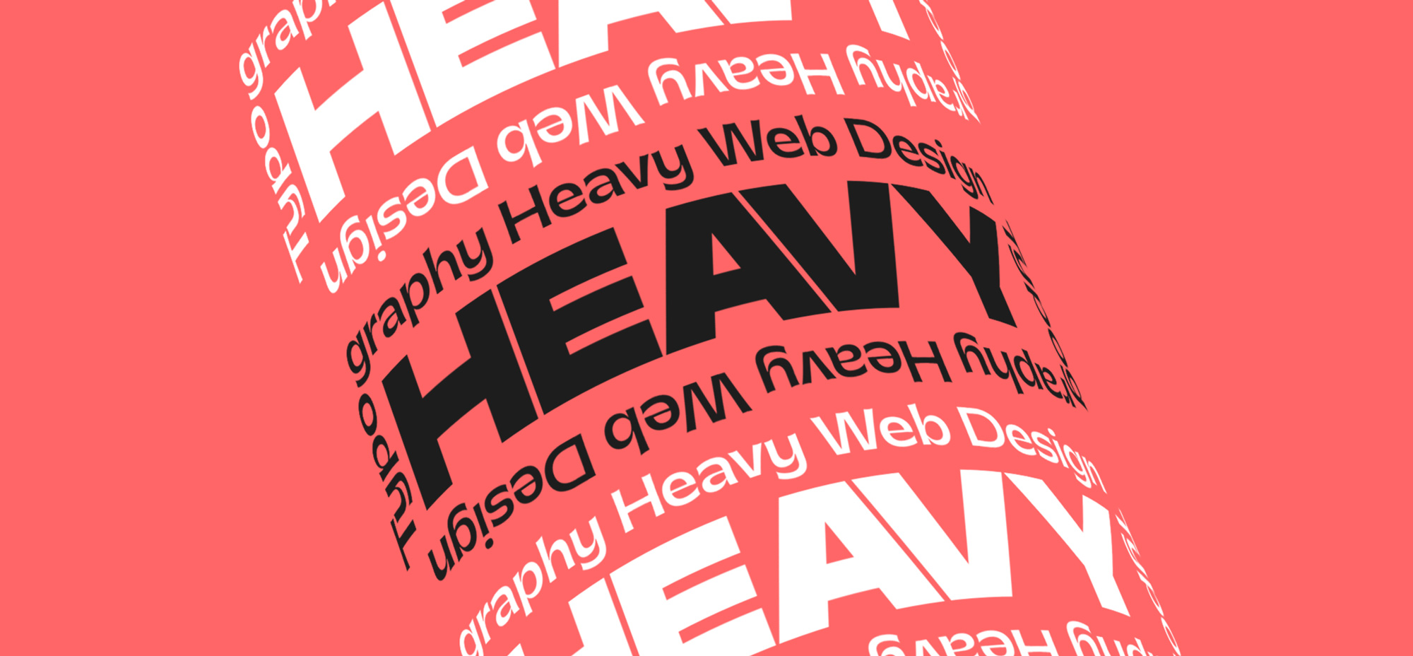
Most companies have a particular font or typography that they use to help their customers immediately identify them versus their competitors. In recent years, designers have received a larger selection of fonts to choose from, making it easier for brands to more accurately express themselves through typography. Viewers will be able to easily understand your content, how it is structured, and how they can navigate through it.
Stick-on / Fixed menu
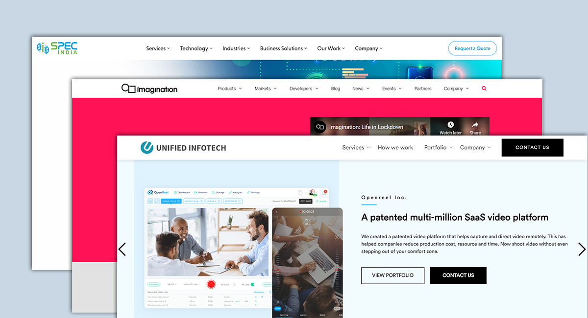
A fixed menu makes browsing a website far easier. Having the main menu of options at your immediate disposal is a major feather in the impatient user’s cap, especially if the website has an exhaustive amount of content contained within. With an ever-present guidepost fixed at the top or side of the screen, a site owner never needs to worry about his or her user flows being dammed up by confusion or immobility.
Giant Product Images

You may have noticed that many websites are starting to display large product images on their sites to highlight different features or parts of their product. Larger product images help designers highlight different features of a product in a more efficient and effective way.
This approach reinforces the benefits of a feature by providing the opportunity to highlight the most valuable pieces. For instance, in the second image, you will notice that there are numbers on the image corresponding with the benefits of certain features.


