Introduction:
In today’s digital landscape, the importance of responsive web design cannot be overstated. As mobile devices continue to dominate web browsing, websites must adapt to different screen sizes and devices to provide optimal user experiences. In this article, we’ll explore the power of responsive web design and how it can significantly enhance user experiences across devices.
Understanding Responsive Web Design:
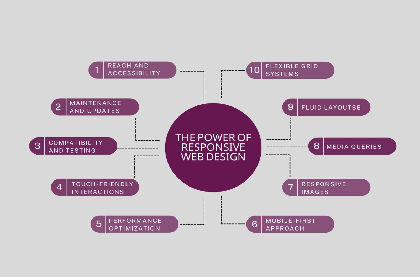
Responsive web design is a design approach that ensures websites adapt fluidly to the screen sizes and resolutions of various devices. By employing a flexible grid system, fluid layouts, media queries, and responsive images, websites can dynamically adjust their design and content to provide a seamless user experience.
Benefits of Responsive Web Design:
- Improved User Experience:
Responsive web design creates a consistent and intuitive browsing experience across devices. With responsive design, users can easily navigate websites and access information, regardless of the device they’re using. This leads to increased engagement, reduced bounce rates, and higher user satisfaction.
- Increased Reach and Accessibility:
By embracing responsive design, websites can reach a wider audience, including mobile and tablet users. Additionally, responsive design ensures accessibility for users with disabilities, complying with web accessibility standards. This broadens the website’s reach and improves its visibility on search engines.
- SEO Advantages:
Responsive design aligns with Google’s mobile-first indexing, where search engines prioritize mobile-friendly websites in search results. By having a single URL and avoiding duplicate content issues, responsive design improves search engine visibility and rankings.
Key Components of Responsive Web Design:
- Flexible Grid Systems:
Implementing grids and breakpoints allows websites to adapt their layout based on different screen sizes. By setting appropriate proportions, websites maintain consistency and visual harmony across devices.
- Fluid Layouts:
Fluid layouts use relative units like percentages to ensure elements adapt to available space. This flexibility enables content to fill the screen appropriately, creating a pleasing visual experience..
- Media Queries:
Media queries enable websites to apply different styles based on screen size, orientation, and device capabilities. Optimizing typography, layout, and images with media queries ensures optimal presentation on different devices.
- Responsive Images:
Responsive design addresses the challenge of delivering appropriately sized images. By using responsive image techniques such as srcset and sizes, websites can serve images that are optimized for each device, resulting in faster page load times.
Best Practices for Implementing Responsive Web Design:
- Mobile-First Approach:
Adopt a mobile-first mindset during the design and development process. Start by designing for mobile devices and progressively enhance the experience for larger screens.
- Performance Optimization:
Optimize website performance by reducing file sizes, minimizing HTTP requests, and leveraging caching techniques. Improved performance enhances user experience, search engine rankings, and mobile usability.
- Usability and Touch-Friendly Interactions:
Design websites with touch-friendly interactions in mind. Optimize touch targets and spacing to ensure ease of use on mobile devices, enhancing overall usability.
Overcoming Challenges and Pitfalls:
- Compatibility and Testing:
Testing websites across different devices, browsers, and platforms can be challenging. Use compatibility testing tools and perform thorough cross-browser and device testing to ensure a consistent experience.
- Maintenance and Updates:
Regular maintenance and updates are crucial to ensure the continued responsiveness and functionality of the website. Prioritize updates to maintain compatibility with new devices and technologies.
- Conclusion:
Responsive web design is a powerful approach that ensures websites deliver exceptional user experiences across devices. By embracing responsive design principles, businesses can engage users, increase their reach, and improve their search engine visibility. In today’s mobile-driven world, responsive web design is not just a trend but a necessity for success in the digital landscape.
Remember to optimize the article